 I have gone through our now finished and fully working interactive flash application, checking for errors and continuity errors and fixing them as I went along, these errors were small and didn’t take long to change. But I’m thankful that I had the time to check for these errors.
Showing posts with label Ben Young. Show all posts
Showing posts with label Ben Young. Show all posts
Monday, April 28, 2008
Flash: Finishing touches.
I have gone through our now finished and fully working interactive flash application, checking for errors and continuity errors and fixing them as I went along, these errors were small and didn’t take long to change. But I’m thankful that I had the time to check for these errors.

Saturday, April 26, 2008
CD Design Print Out
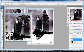
Ben and Shakel had already designed the Front and Back Cover of the DVD cover, therefore with their images they had used I put together their designs into one and decided to print that onto a DVD to make it look more like a DVD game.
Friday, April 25, 2008
Flash: Adding Audio.
To further push the emotion we wanted to put across to the user, we wanted to use strong moving music in the created scenes, that we hope will mach the emotion of that scene.

The levels of the music were hard to get correct in flash, I had to continually chance the level that it plays at so it is calm and consistent through out the game, but it was worth every second that it took giving allowing the game to reach a user on a more personal level.
Saturday, April 19, 2008
Flash: review conversation.
After the user has finished talking to all of the suspects, before they are asked to accuse a suspect they will have a chance to review and go over any of the previous conversations that the user has had, allowing the opportunity to ask questions that they hadn’t previously, and find more evidence again a suspect.

The user will have to click on a suspect in the menu shown above, after they do so they will have a chance to question them again, after this the user will be taken back to this menu. If the user is ready to accuse a suspect they can click the "Accuse a Suspect" button to be taken to the next scene.
Wednesday, April 9, 2008
Flash: Security guard conversation.
The detective will see the security guard after he has seen his wife; it will be up to the user to click on the security guard in the scene below to initiate the conversation and find out what he knows.

The security guard will be animated to and extent, the image of him will change often between different expressions, to give the illusion of movement. The conversational text is animated word by word and will be displayed slowly below him in different colours to represent who is talking. green wioll represent the Security guard talking. 
The security guard will be animated to and extent, the image of him will change often between different expressions, to give the illusion of movement. The conversational text is animated word by word and will be displayed slowly below him in different colours to represent who is talking. green wioll represent the Security guard talking.
Wednesday, March 12, 2008
Drive to Museum
After the detective is told about his wife’s passing he then gets in to his car and drives to the museum, determined to solve the case. This scene will follow the style of the introduction and feel like an interactive movie that being said this scene will lean more towards a movie rather than the interactivity side, this is because of how emotional the detective would be, and we don’t think that even he would have much control over him self at this point.

I will be using layered images in flash, then I will be manipulating them using action script and tweens to give the illusion of movement and 3d space, giving a much more involving experience for the user. This scene will also be used to display the names of the creators between each of the image fades.
I will be using layered images in flash, then I will be manipulating them using action script and tweens to give the illusion of movement and 3d space, giving a much more involving experience for the user. This scene will also be used to display the names of the creators between each of the image fades.
Monday, March 10, 2008
Intro.
I have begun creating the intro movie for our interactive application, following the storyboards I previously created I have started bringing all our files together to create an interactive movie like introduction, hoping to not only entertain but to also capture and transfer the user into a gritty Noir themed adventure. as this is simply the introduction the user will not be able to interact with the scene and it will just be used to get the story across.

The introduction will follow the storyboard very closely, using very close shots of people (as shown below) and places to better allow an emotional connection between the user and the characters in the game.

The introduction will follow the storyboard very closely, using very close shots of people (as shown below) and places to better allow an emotional connection between the user and the characters in the game.
Sunday, March 2, 2008
Flash Developmental Designs
Viewing the world
This will be what the user sees before they enter a conversation. A user can either click on the character on screen to begin questioning them, or they can select around the background to see if there are any interactive elements, for this example we have a bin in the centre of the screen and if the user clicks it then a new event will load in which the detective searches through it for evidence.
At the bottom left of the screen we see a list of items that the user has found and collected it will be up to the user to use these to progress through the story, for example the key will open a door in which allows the story to expand, or the piece of paper holds the combination needed to view the museums security tapes and remove suspicion from a person locked inside the museum.

Conversation
After the user selects a suspect to question, the following screen will be displayed with a list of questions that the user can have the detective ask. By clicking on a question it will run the animation of the suspect responding.

Below shows a response to question one, the text of the reply will be displayed word for word and the character to the right will animate giving the illusion of actual speech

After the detective has finished questioning the suspect a mini biography will appear giving the user a small incite in to the character they have just questions allowing a better understanding of the person just questioned.

Below is another interactive scene in which the user can select the object in the world before them in order to interact. In this scene the user is outside and is on an evidence collecting mission. If the user selects the bin then they will find a blood covered shirt and start the animation of the detective finding and picking it up then expressing his emotions based on what he has found. To the left of the bins lies a gun that the killer has also dropped once again this will run the animation of the detective picking the object up and expressing his emotions. After the user is happy and thinks that they have collected all the evidence available they can click on the green door to progress to the next scene, with or without all of the evidence.

This will be what the user sees before they enter a conversation. A user can either click on the character on screen to begin questioning them, or they can select around the background to see if there are any interactive elements, for this example we have a bin in the centre of the screen and if the user clicks it then a new event will load in which the detective searches through it for evidence.
At the bottom left of the screen we see a list of items that the user has found and collected it will be up to the user to use these to progress through the story, for example the key will open a door in which allows the story to expand, or the piece of paper holds the combination needed to view the museums security tapes and remove suspicion from a person locked inside the museum.

Conversation
After the user selects a suspect to question, the following screen will be displayed with a list of questions that the user can have the detective ask. By clicking on a question it will run the animation of the suspect responding.

Below shows a response to question one, the text of the reply will be displayed word for word and the character to the right will animate giving the illusion of actual speech

After the detective has finished questioning the suspect a mini biography will appear giving the user a small incite in to the character they have just questions allowing a better understanding of the person just questioned.

Below is another interactive scene in which the user can select the object in the world before them in order to interact. In this scene the user is outside and is on an evidence collecting mission. If the user selects the bin then they will find a blood covered shirt and start the animation of the detective finding and picking it up then expressing his emotions based on what he has found. To the left of the bins lies a gun that the killer has also dropped once again this will run the animation of the detective picking the object up and expressing his emotions. After the user is happy and thinks that they have collected all the evidence available they can click on the green door to progress to the next scene, with or without all of the evidence.

Saturday, March 1, 2008
Editing in Photoshop

I have taken the images we have taken using Photoshop using the Noir style as the main theme, firstly to create this style I applied a grey scale to the image then I applied a level layer to alter the definition of the blacks, whites and greys in the image altering them independently based on the image taken.

I had repeated this style but made small changes based on what the image required to keep it consistent with the next.
Wednesday, February 27, 2008

Suspect’s alibis storyboarded
Each suspect will have an alibi that will be told through video to the detective below we have the storyboard for each of the characters alibis.
Bus Driver and security guard

Shax Malik

Janitor

Shop Owner

Suzzy Bains

Bus Driver and security guard

Shax Malik

Janitor

Shop Owner

Suzzy Bains

Tuesday, February 26, 2008
Storyboard
These storyboards depict the actions and camera movements of the start of the game 


The first shows the detective dreaming about his wife then being awoken by the phone ringing to be told that she has been shot and killed.

The second has the detective learning that his wife was killed in a museum as a robbery turned bad and the thief got away but is still locked inside the museum.

The third shows the detective driving to the museum. Each image will have credits fading in and out between them

The forth is his coming to the museum she was killed in, and seeing his dead wife.

Sunday, February 24, 2008
Final company logo
To begin with I started by using an image of the detective we were going to have star in our current game. Then I applied a grey scale to the image taking the colour from the image, I then manipulated the layers allowing me to remove most of the definition of the character leaving the image below.

Then I used the paint brush to create the, paint like, splatter effect. I then used the drag and blur tools to manipulate the image to make it look more realistic. After this I opened the Blending options and applied an outer glow with a red tint then I applied a bevel to the image to give it more definition. Resulting in the image below

The crows were next, and once again I used the paint brush to create them afterwards using the blending options I applied a bevel effect and a slight shadow, the result can be seen below.

After I was happy with this, I was able to concentrate on the text. I had earlier decided to use the font Papyrds, this proved to be a wise choice after I had used the blending option and applied a bevel effect, the to add more depth I gave it a outside glow using a lighter colour to focus attention at this first below is an example of this.

And here we have the finished version.


Then I used the paint brush to create the, paint like, splatter effect. I then used the drag and blur tools to manipulate the image to make it look more realistic. After this I opened the Blending options and applied an outer glow with a red tint then I applied a bevel to the image to give it more definition. Resulting in the image below

The crows were next, and once again I used the paint brush to create them afterwards using the blending options I applied a bevel effect and a slight shadow, the result can be seen below.

After I was happy with this, I was able to concentrate on the text. I had earlier decided to use the font Papyrds, this proved to be a wise choice after I had used the blending option and applied a bevel effect, the to add more depth I gave it a outside glow using a lighter colour to focus attention at this first below is an example of this.

And here we have the finished version.

Friday, February 15, 2008
Costume in Noir Film
In the 1040’s when the noir style was at its biggest, women were often seen in long dark flowing dresses, this focused the viewer’s attention, not only on the actresses face, but on the shape of her body, giving any film more sex appeal.
Women in noir films have always been depicted as self reliant and emotionally strong, as these films were all created post war. women had been liberated, and now had the freedom to behave and speak with more freedom and confidence. Dress styles seemed to follow this freedom and confidence into cinema and have continued to evolve since then.

Image from Sunset Boulevard 1950; dir. Billy Wilder
Male protagonists in noir films are often dressed in a strong masculine suit and hat, this style of clothing has been used to make a character seem more tough and solitary, but also caring and approachable depending on the man within the suit.
Post war, men had come home after seeing horrendous things that had changed them, taking all emotion and leaving them dulled form the world around them. These men seemed lost, but dressed in a suit some how they looked natural, able to survive in a new world in which they hadn’t seen for years.

Image from Sunset Boulevard 1950; dir. Billy Wilder
This style of clothing has always been strong in noir film, but it is very dated. As our game is to be in a contemporary style, any female characters will be asked to dress in a casual smart style that they find comfortable. The male protagonist will dress in a suit and hat, to help give a cold and distant feel to the character. Other male characters will be asked to dress smart in black and white colors
below is the costume designs for four main characters within the game, we agreed on these costumes after discussing what we considered to be modern, but also keeping true to the noir style. from left to right we have Detective Jack L Spencer, Suki Spencer (Jacks Wife), Shax Malik and Suzzy Bains.

Women in noir films have always been depicted as self reliant and emotionally strong, as these films were all created post war. women had been liberated, and now had the freedom to behave and speak with more freedom and confidence. Dress styles seemed to follow this freedom and confidence into cinema and have continued to evolve since then.

Image from Sunset Boulevard 1950; dir. Billy Wilder
Male protagonists in noir films are often dressed in a strong masculine suit and hat, this style of clothing has been used to make a character seem more tough and solitary, but also caring and approachable depending on the man within the suit.
Post war, men had come home after seeing horrendous things that had changed them, taking all emotion and leaving them dulled form the world around them. These men seemed lost, but dressed in a suit some how they looked natural, able to survive in a new world in which they hadn’t seen for years.

Image from Sunset Boulevard 1950; dir. Billy Wilder
This style of clothing has always been strong in noir film, but it is very dated. As our game is to be in a contemporary style, any female characters will be asked to dress in a casual smart style that they find comfortable. The male protagonist will dress in a suit and hat, to help give a cold and distant feel to the character. Other male characters will be asked to dress smart in black and white colors
below is the costume designs for four main characters within the game, we agreed on these costumes after discussing what we considered to be modern, but also keeping true to the noir style. from left to right we have Detective Jack L Spencer, Suki Spencer (Jacks Wife), Shax Malik and Suzzy Bains.

Thursday, February 14, 2008
Logo design
Below we have provided an early sketch of the logo we hope to achieve for our company, to the top right of the image we have also included the colours we hope to use.
In the middle we have a detective with deep levels of black and white below him he will slowly fade in to a black blood splatter effect. Above him we would like the effect of crows flying over head.

In the middle we have a detective with deep levels of black and white below him he will slowly fade in to a black blood splatter effect. Above him we would like the effect of crows flying over head.

Sunday, February 10, 2008
Logo Research
Our company relies heavily on multimedia and because of this we want to have a logo that is very image heavy below I have collected three other logos form already existing companies that use images to help a customer recognise the business.
Tadpoles Early Learning Centres

The first logo is from a company called Tadpoles Early Learning Centres. This logo has a simple design intended for the audience of children and young mothers. The fonts used suit the company and the service they provide, the image used is one that meets its purpose but I feel that it takes focus from the company name, which I feel is very important that both be eye-catching, but not have one over shadow the other.
Although this has a nice cartoon style, it isn’t one that would be well suited for our company, the layout feels poorly thought out, the colour seems bland and boring.
8PAWSUP.COM

The second logo is from the company 8pawsup.com, this is one that I found to be very visually pleasing in its style and formation of text. But I found the lack of colour to be very disappointing. Although the image matches its purpose I think the design style is dull and lacks imagination.
This is another logo design that wouldn’t suit our company the lack of different colour leaves the logo looking bland. That being said I do like the layout of the text with the image it allows the viewer to take the whole logo in at once and easily process what they see.
Metal Mulisha

The third logo is from a company named Metal Mulisha an is the one that I found the most eye-catching, this was mostly because of the style of imagery used in the background and I have always been a fan of this hectic style. The actual text and the skull image leave something to be desired, and in my opinion, don’t match the background used.
I would like the company logo to follow the style of the background this hectic and somewhat messy style is one that I feel suites that of a multimedia company. The text, and the image beside it, is the only thing I don’t like about this logo, as I think that it is a little messy and uninspired.
Tadpoles Early Learning Centres

The first logo is from a company called Tadpoles Early Learning Centres. This logo has a simple design intended for the audience of children and young mothers. The fonts used suit the company and the service they provide, the image used is one that meets its purpose but I feel that it takes focus from the company name, which I feel is very important that both be eye-catching, but not have one over shadow the other.
Although this has a nice cartoon style, it isn’t one that would be well suited for our company, the layout feels poorly thought out, the colour seems bland and boring.
8PAWSUP.COM

The second logo is from the company 8pawsup.com, this is one that I found to be very visually pleasing in its style and formation of text. But I found the lack of colour to be very disappointing. Although the image matches its purpose I think the design style is dull and lacks imagination.
This is another logo design that wouldn’t suit our company the lack of different colour leaves the logo looking bland. That being said I do like the layout of the text with the image it allows the viewer to take the whole logo in at once and easily process what they see.
Metal Mulisha

The third logo is from a company named Metal Mulisha an is the one that I found the most eye-catching, this was mostly because of the style of imagery used in the background and I have always been a fan of this hectic style. The actual text and the skull image leave something to be desired, and in my opinion, don’t match the background used.
I would like the company logo to follow the style of the background this hectic and somewhat messy style is one that I feel suites that of a multimedia company. The text, and the image beside it, is the only thing I don’t like about this logo, as I think that it is a little messy and uninspired.
Saturday, February 9, 2008
Tv Research
The style we all agreed on was Film Noir, as we felt that it best matched the style of storytelling we were to use. Below is a link to a YouTube video form Season six of Smallville. In this Jimmy is hit over the head and in his unconscious state enters a dream where he and his friends are living their lives in the 1940’s. (Link Below) this short video shows the look we hope to achieve within our game but in a more contemporary style.

http://www.youtube.com/watch?v=rekhPn5Ofvk

http://www.youtube.com/watch?v=rekhPn5Ofvk
Friday, February 8, 2008
Visual Research
To help myself storyboard the application and keep the style true to film Noir, I have purchased a book named “The Noir Style” by Alan Silver & James Ursini, which is a breakdown of the noir style and characters using images taken from classic films. (Link Below) I have also purchased “How to Draw Noir Comics” by Shawn Martinbrough, this gives a more artistic view on the Noir style and instructs the reader how to build suspense and strong characterization by just using imagery. (Link Below) Using both of these books I hope to create a storyboard that is stylish and follows to the noir style well.

http://www.imagesjournal.com/issue09/reviews/noirstyle/text.htm

http://www.thegmcgroup.com/item--How-to-Draw-Noir-Comics--WG-16257.html

http://www.imagesjournal.com/issue09/reviews/noirstyle/text.htm

http://www.thegmcgroup.com/item--How-to-Draw-Noir-Comics--WG-16257.html
Thursday, February 7, 2008
Flash Research
At first we wanted to use cartoon imagery with serious look and feel to for the application, very much like the game “A Case of the Crabs” created by Marc Darin and Jason Ellis (Link Below) this game follows the style of the point and click adventure games that were widely available during the nineties.

http://www.heavygames.com/acaseofthecrabs/showgame.asp
After playing this game, we liked the visual and audio style, but we wanted to create a game that made the user feel like they were actually the detective, not just in control of him. This let my search to the game “Detective Grimoire” by The Super Flash Bros & Armor Games. (Link Below) This game gave the user the chance to take a first person view of the world around them then as they entered a conversation the style would change allowing the user to ask another a series of questions and progress the story.

http://www.freegamesnews.com/en/games/DetectiveGrimoire.html
We liked the technical style of the game, but we didn’t really care for the cartoon and humorous approach they used within the application, which we felt didn’t really suit the Noir style.
For our detective game we hope to use real locations then apply them to the visual style used in “A Case of the Crabs” then work all this to the technical style of “Detective Grimoire” by having interactive conversations.

http://www.heavygames.com/acaseofthecrabs/showgame.asp
After playing this game, we liked the visual and audio style, but we wanted to create a game that made the user feel like they were actually the detective, not just in control of him. This let my search to the game “Detective Grimoire” by The Super Flash Bros & Armor Games. (Link Below) This game gave the user the chance to take a first person view of the world around them then as they entered a conversation the style would change allowing the user to ask another a series of questions and progress the story.

http://www.freegamesnews.com/en/games/DetectiveGrimoire.html
We liked the technical style of the game, but we didn’t really care for the cartoon and humorous approach they used within the application, which we felt didn’t really suit the Noir style.
For our detective game we hope to use real locations then apply them to the visual style used in “A Case of the Crabs” then work all this to the technical style of “Detective Grimoire” by having interactive conversations.
Subscribe to:
Posts (Atom)