Friday, February 29, 2008
Photoshop Editing
Thursday, February 28, 2008
Front cover development
I started off with some rough ideas on paper and there were two ideas which i felt confident with. The first one was good, but it didnt have the neccessary "lonely" feel to it. So i decided to go with the 2nd idea.
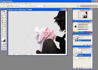
Here are screenshots showing the development of the work. The idea was to get across a feeling of solitude in the Noir style.
here is the Final image. I tried to make the Blacks in the picture as dark and contrasted as possible to show the Noir style.
I was working with the colours and decided to do some experimenting. Here is a version of the final cover which will not be used but has an alternate colour scheme.
Wednesday, February 27, 2008
Suspect’s alibis storyboarded
Tuesday, February 26, 2008
Storyboard
The first shows the detective dreaming about his wife then being awoken by the phone ringing to be told that she has been shot and killed.
The second has the detective learning that his wife was killed in a museum as a robbery turned bad and the thief got away but is still locked inside the museum.
The third shows the detective driving to the museum. Each image will have credits fading in and out between them
The forth is his coming to the museum she was killed in, and seeing his dead wife.
Monday, February 25, 2008
Interface Main Menu Design Ideas
The first design idea is basically a close up of a door with the detective's name and the links underneath with a picture of the detective in the background like its a window looking into the office.
The second design idea is where the detective is walking closer and closer to the viewer and as he walks each link pops up.
The third design idea is where the title 'Detective X' fades in with a shadow effect applied to it then the following 4 characters come onto the scene with the links above each person.
Sunday, February 24, 2008
Final company logo
Then I used the paint brush to create the, paint like, splatter effect. I then used the drag and blur tools to manipulate the image to make it look more realistic. After this I opened the Blending options and applied an outer glow with a red tint then I applied a bevel to the image to give it more definition. Resulting in the image below
The crows were next, and once again I used the paint brush to create them afterwards using the blending options I applied a bevel effect and a slight shadow, the result can be seen below.
After I was happy with this, I was able to concentrate on the text. I had earlier decided to use the font Papyrds, this proved to be a wise choice after I had used the blending option and applied a bevel effect, the to add more depth I gave it a outside glow using a lighter colour to focus attention at this first below is an example of this.
And here we have the finished version.
Friday, February 22, 2008
Production Progress
Josephine Lee, Sarah's cousin, came in to help take photos. The 2 slideshows are pictures that we've all taken.
Friday, February 15, 2008
Costume in Noir Film
Women in noir films have always been depicted as self reliant and emotionally strong, as these films were all created post war. women had been liberated, and now had the freedom to behave and speak with more freedom and confidence. Dress styles seemed to follow this freedom and confidence into cinema and have continued to evolve since then.
Image from Sunset Boulevard 1950; dir. Billy Wilder
Male protagonists in noir films are often dressed in a strong masculine suit and hat, this style of clothing has been used to make a character seem more tough and solitary, but also caring and approachable depending on the man within the suit.
Post war, men had come home after seeing horrendous things that had changed them, taking all emotion and leaving them dulled form the world around them. These men seemed lost, but dressed in a suit some how they looked natural, able to survive in a new world in which they hadn’t seen for years.
Image from Sunset Boulevard 1950; dir. Billy Wilder
This style of clothing has always been strong in noir film, but it is very dated. As our game is to be in a contemporary style, any female characters will be asked to dress in a casual smart style that they find comfortable. The male protagonist will dress in a suit and hat, to help give a cold and distant feel to the character. Other male characters will be asked to dress smart in black and white colors
below is the costume designs for four main characters within the game, we agreed on these costumes after discussing what we considered to be modern, but also keeping true to the noir style. from left to right we have Detective Jack L Spencer, Suki Spencer (Jacks Wife), Shax Malik and Suzzy Bains.
Thursday, February 14, 2008
Logo design
In the middle we have a detective with deep levels of black and white below him he will slowly fade in to a black blood splatter effect. Above him we would like the effect of crows flying over head.
Wednesday, February 13, 2008
Character Bio's
Age: mid 20’s
Sex: Male
Eyes: Brown
Hair: Brown
Education: Received a degree from the country’s top criminal law university, exceptionally smart.
Occupation: Private detective
Marital status: Married (no children)
Personality: Very determined at whatever he sets his mind to, never gives up and has never failed a task set to him. Very stubborn and arrogant but is usually always right. He is Strong and silent. He spends more time concentrating on internal thoughts than speaking. He doesn't overlook the details and plans everything in advance
Character flaws: Because he is arrogant, he never accepts help and is often alone. He is closed off and has a relatively limited number of friends.
Character strengths: Is highly independent and can work under serious pressure. A very skilled detective who’s intelligence has saved his life and the life of others on numerous occasions.
Likes: Likes challenges and takes up the most difficult missions. He likes strong coffee and his wife.
Dislikes: He dislikes losing. He cannot stand people who talk too much, they annoy him.
Background info: Started off working with the force but he didn’t like being told what to do or their methods. He went private four years ago and has the highest reputation in the business. Met ***** while working a case for her soon after he went private. They got married two years ago.
----------------------------------------------------------------------------------
Name: Suki Spencer
Age: 26
Sex: Female
Eyes: Brown
Hair: Black/brown
Education: History related degree with main focus on artefacts. A university graduate with a PHD
Occupation: Museum Curator
Marital status: Married (no children)
Personality: Strong willed and very responsible. Is always very curious and likes to understand people. A very happy person, she loves her life and job. Believes there is always a choice
Character flaws: Her curiosity sometimes gets her in trouble and can sometimes be over sensitive.
Character strengths: Can always be counted on to get anything done. Very friendly and can always bring the best out of a person.
Likes: Likes spending time with her husband. Is a huge fan of any rare artefact and loves the mysteries that history holds.
Dislikes: Dislikes anything that harms the body such as cigarettes
Background info: She comes from a wealthy family who wanted her to follow in the family tradition and become a lawyer. She had no passion for it so she went on her own and worked hard to succeed in life. Found many rare artefacts, some of which she sold to make enough money to construct a museum.
----------------------------------------------------------------------------------
Name: Shax Malik
Age: 25
Sex: Male
Eyes: Brown
Hair: Black
Education: History related degree with main focus on artefacts. A university graduate with a PHD
Occupation: Professional Hitman/Thief
Marital status: Not known
Personality: Highly skilled and educated but uses both for wrong deeds. He is not very talkative and is mysterious. Although mean, he does not have a short temper because short tempers lead to mistakes. Always gets his job done no matter how many people it requires killing
Character flaws: Can be too over confident now that he has established himself.
Character strengths: Can be relied upon to get a certain job done. He’s lack of emotion means he never complicates anything.
Likes: Plotting and scheming his next devious plan. Likes gadgets
Dislikes: Everyone
Background info: Well known across the criminal underworld, He started off small but quickly moved up the ranks due to his intelligence and ruthlessness. Thinks Jack will be a good challenge for him
----------------------------------------------------------------------------------
Name: Suzzy Bains
Age: 21
Sex: Female
Eyes: Brown
Hair: Black
Education: Currently in university studying science
Occupation: Museum Receptionist (part time)
Marital status: Single
Personality: Very chatty and slightly loopy. She’s very naïve and is excited most of the times. Enjoys her job at the Museum and is very sociable
Character flaws: She can annoy people easily, especially Jack
Character strengths: Makes people laugh and is a great person to have around
Likes: Likes her mobile phone and laptop. Enjoys spending time with friends and going shopping
Dislikes: Dislikes insects and other creepy crawlies. Doesn’t like scary movies because of the blood
Background info: Comes from a wealthy family, living alone in a luxurious flat while studying at university. Is in her final year of university and hopes to become a Geologist. Father recently passed away so Suzzy has inherited her father’s wealth. His dying wish was that she finished university and not rely on the money. She is the insurer for the diamond that has been stolen
Tuesday, February 12, 2008
Royal Armouries Trip
We got some really good ideas and pictures that we'd like to use in our project, and here are some of the photo's we took. I've only uploaded a few as we took far too many to upload them all.
Monday, February 11, 2008
Sunday, February 10, 2008
Games Logo Research
Grand Theft Auto IV
The first logo is from the computer game Grand Theft Auto 1V. The first thing that you notice when looking at the logo is does not have any imagery, the main focus of the logo is the text itself. The size and the simple style of the text also ensures that the logo is easy to read and eye catching in a subtle way .It is worth noting that all pervious Grand theft Auto games have used the same logo to be consistent.
The Legend of Zelda: Four Swords Adventures
The next logo is from the Legend of Zelda computer game. The logo has a number of strengths; the font used and the effects put on the text (especially the word “ZELDA”) make the writing stand out. The colours that have been used all seem to go well together to make the overall end product look flawless. The imagery used is of a very professional quality and also states that Swords are going to be the main feature of the game without having to read the text.
Quake II
The third logo is taken from a computer game Quake II. Although the logo has strengths such as being simple the font used for the game name is very hard to read. That being said I do like the way the logo is laid out to make the symbol in the middle the main focus rather than the text.
Logo Research
Tadpoles Early Learning Centres
The first logo is from a company called Tadpoles Early Learning Centres. This logo has a simple design intended for the audience of children and young mothers. The fonts used suit the company and the service they provide, the image used is one that meets its purpose but I feel that it takes focus from the company name, which I feel is very important that both be eye-catching, but not have one over shadow the other.
Although this has a nice cartoon style, it isn’t one that would be well suited for our company, the layout feels poorly thought out, the colour seems bland and boring.
8PAWSUP.COM
The second logo is from the company 8pawsup.com, this is one that I found to be very visually pleasing in its style and formation of text. But I found the lack of colour to be very disappointing. Although the image matches its purpose I think the design style is dull and lacks imagination.
This is another logo design that wouldn’t suit our company the lack of different colour leaves the logo looking bland. That being said I do like the layout of the text with the image it allows the viewer to take the whole logo in at once and easily process what they see.
Metal Mulisha
The third logo is from a company named Metal Mulisha an is the one that I found the most eye-catching, this was mostly because of the style of imagery used in the background and I have always been a fan of this hectic style. The actual text and the skull image leave something to be desired, and in my opinion, don’t match the background used.
I would like the company logo to follow the style of the background this hectic and somewhat messy style is one that I feel suites that of a multimedia company. The text, and the image beside it, is the only thing I don’t like about this logo, as I think that it is a little messy and uninspired.